<onWebFocus />
Knowledge is only real when shared.
Responsive React Native?!
August 2022
A plugin offering several ways to make a React Native application responsive.
Responsive Web Design has been around for a very long time and allows us to view what's mostly the same site on various devices. The UI for mobile applications on the other hand is traditionally written as one-size-fits-all. Even though screen resolutions have increased drastically phone manufacturers have avoided the issue by doubling or tripling existing pixels. When the resolution is doubled one traditional pixel becomes four pixels. The UI stays the same except that it becomes crisper whenever possible.
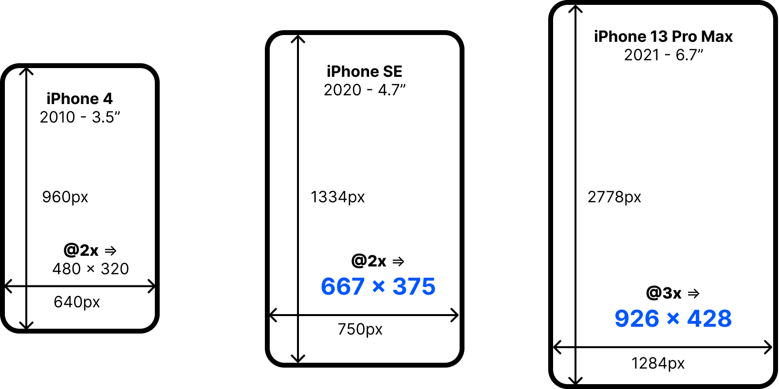
Illustrates the evolution of device resolution and sizes.
This approach makes a lot of sense as the physical screen sizes haven't doubled or tripled unlike their pixel based counterparts. On the first smartphones like the iPhone the individual pixels were clearly distinguishable. With the iPhone 4 Apple introduced the so called Retina display. Everything stayed the same, except the resolution had doubled. As a handheld device the phone is very flexible and users can easily move the display closer if something isn't initially discernable.
Fragmentation and Native Approaches
When creating a cross-platform mobile application today the target devices are very fragmented. Native UI frameworks for Swift (iOS) and Kotlin (Android) don't offer anything that allows the developer to scale the size depending on the size of the device. On iOS there are so called Size Classes available that can be used to recognize portrait vs. landscape and phone vs. tablet. On the level of the portrait phone, which makes up most applications in use, there are no specific size classes available.
Without a way to make applications responsive they inevitably end up with lots of white-space on large devices and very crowded on smaller devices. Landscape mode is usually the same UI but barely usable especially when the keyboard opens.
A New Way to Responsive
Most React Native developers are familiar with the Responsive Web Design approach taken on the web but are left wondering how to do something similar on the phone. There are some existing plugins to make React Native applications responsive. This plugin however goes much further while still being simpler. It offers two approaches that can easily be combined. The first one is compatible with existing StyleSheet.create styles and can quickly make an existing application responsive. The second approach inspired by Styled-Components known from CSS-in-JS is much more flexible.
Responsive Stylesheets
By replacing StyleSheet.create calls with createStyles the existing styles can be reused. All numeric size variables are automatically scaled depending on the size of the viewport.
The stylesheet is initialized only once. In order for the native values to be scaled each individual style like styles.view is wrapped in a Proxy that will yield different values depending on the current viewport state. If the orientation, the viewport or the breakpoint changes the values remain the same as the React components aren't rerendered. For applications where scaled rendering initially according to the current viewport isn't enough the application can be wrapped with the <Rerender component at the top. With this in place the styles will adapt whenever changes occur.
Scaled Values
This plugin relies on a very flexible approach that has already been described in this blog for the web with another plugin. The idea is to linearly scale the values between a minimum breakpoint and a maximum breakpoint. The value in the stylesheet will be used in the middle between these two and at best matches the most popular resolutions used.

Illustrates how responsive values are linearly scaled.
Adaptive Values
Since the styles are regenerated on every breakpoint or orientation change a different approach can be taken to pick the proper values. In CSS the default styles are provided and the overridden by whole blocks of values for a certain breakpoint. Adaptive values designate the approach taken by this plugin to pick the proper styles inline, without the need for overrides.
An adaptive value is either an object with breakpoints as keys or an array with two values. When an object with breakpoints as keys is used the value matching the current breakpoint or the one below will be used. An array on the other hand is used for the orientation where the first value is used for portrait and the second for landscape.
Styled-Component Interface
React Native has been what's called CSS-in-JS on the web from the get-go. However, the stylesheet based approach is very limited and makes it very cumbersome to write conditional styles. The successul approach of using styled components where a base component like a View or a div is attached with some styles and can then be reused anywhere like the base it's wrapping. Props can be used during rendering to set different instances apart. Numeric values will automatically scale and different styles can be applied based on the current breakpoint.
Unlike on the web, React Native doesn't have a class abstraction and the styles are rendered just like inline styles would be on the web. Thanks to this only the styles have to be recalculated when something changes. Styled components don't require the React tree to rerender in order to match the styles after a change.
Reactive Styles
When mobx is installed and a function is passed to generate the styles they become reactive. This means the styles will automatically update even if the viewport and the props stay the same but only and observable used has changed. This can be compared to wrapping a React component with observer from mobx-react-lite but on the level of the styles only.
This approach avoids having to pass additional props and can directly connect component styles to state from anywhere.
Existing Alternatives
There are a few existing plugins on npm to create responsive React Native applications. Most aren't maintained anymore and very much outdated. Also, the methods are very basic while the interfaces are verbose. The most popular is react-native-responsive-screen which only offers two methods which turn a percentage based value of the viewport into a pixel value. While this approach can work it's different from traditional styles and cannot be configured. A little less popular is react-native-responsive-dimensions which offers the same helper methods converting percentages into pixel based values. Both of these plugins require a laborious refactoring of every stylesheet. It's worth mentioning that there are also some plugins that offer breakpoint and orientation based styles. react-native-responsive-stylesheet and responsive-native are worth mentioning in this regard, with neither of them having gained any traction yet. Last but not least, there is react-native-responsive which has some downloads and quite a lot of stars on GitHub. This plugin has lots of features but a badly structured documentation and was last published 5 years ago and is therefore unlikely to work with the current version of React Native.